
from an interaction
design perspective
ELEVATING SIT
Scope
From August 2024 to November 2024 i did a design internship at the student welfare organisation Sit. During the internship i learned how to structure my own workday by finding new tasks to do, and by adjusting what projects to focus on or not within a bigger project. Sit wanted me to write a report that looked into how to better the digital platforms they had, from an interactional designers point of view.
The project in it self is built up by different insight, i did a workshop, some prototyping, and a lot of meetings to understand how the digital team at Sit worked, and how the digital platforms were built up. Before i presented it all in a report, with recommendations and spesific changes they could make. I did not follow a process model for this project.
Tools
For the project i used Figjam to create models for the different methods i did, and Figma for the prototyping and digital workshop, as well as discord for the communication during the workshop.
X
design internship
Sit trening
Sit trening is the gym service for students and employees of the universities in the three different cities. Since i didn’t get any restrictions or direction in where to begin, i chose to start with the task of gaining a gym membership.
I started by creating a user flow, which shows the different steps you have to go through, before you end up with a membership. Through out the process i met several pain points, and set up the task as a user journey as well.
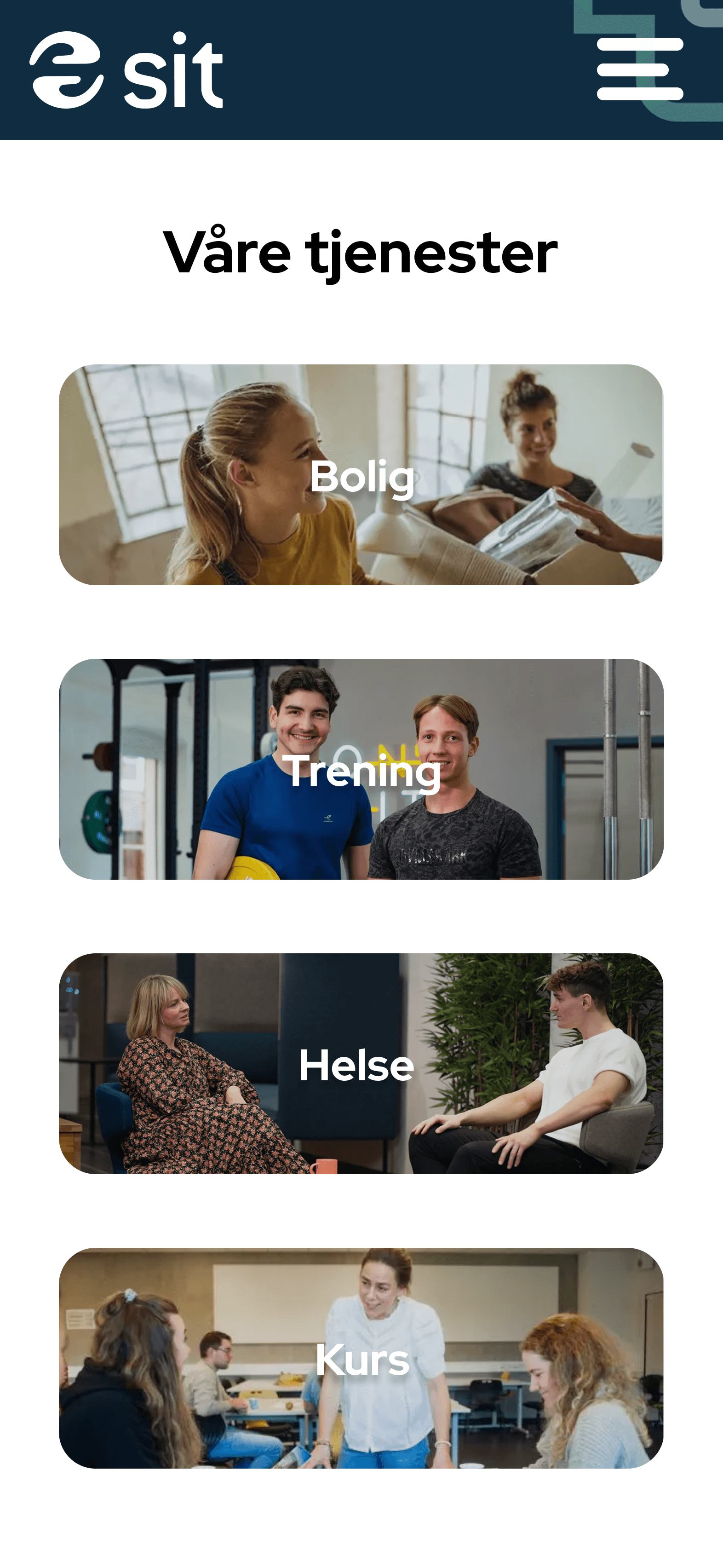
Sit - student welfare organisation
Sit as the student welfare organisation for Trondheim, Gjøvik and Ålesund, is built up by several services. You have student housing, gym, health, canteen and catering. Three of these services have their “own” website, and so i looked into how all three could give the feeling you are still on the same site.
YES
YES
YES
NO
NO
NO

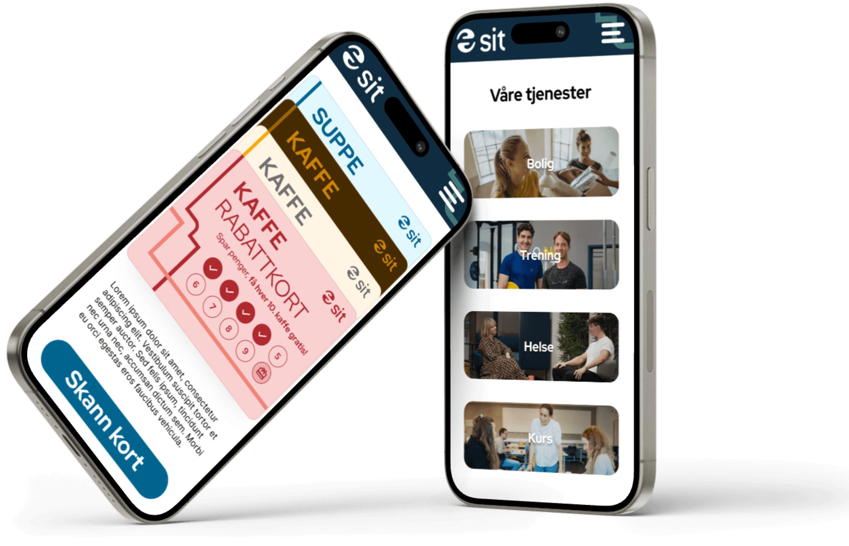
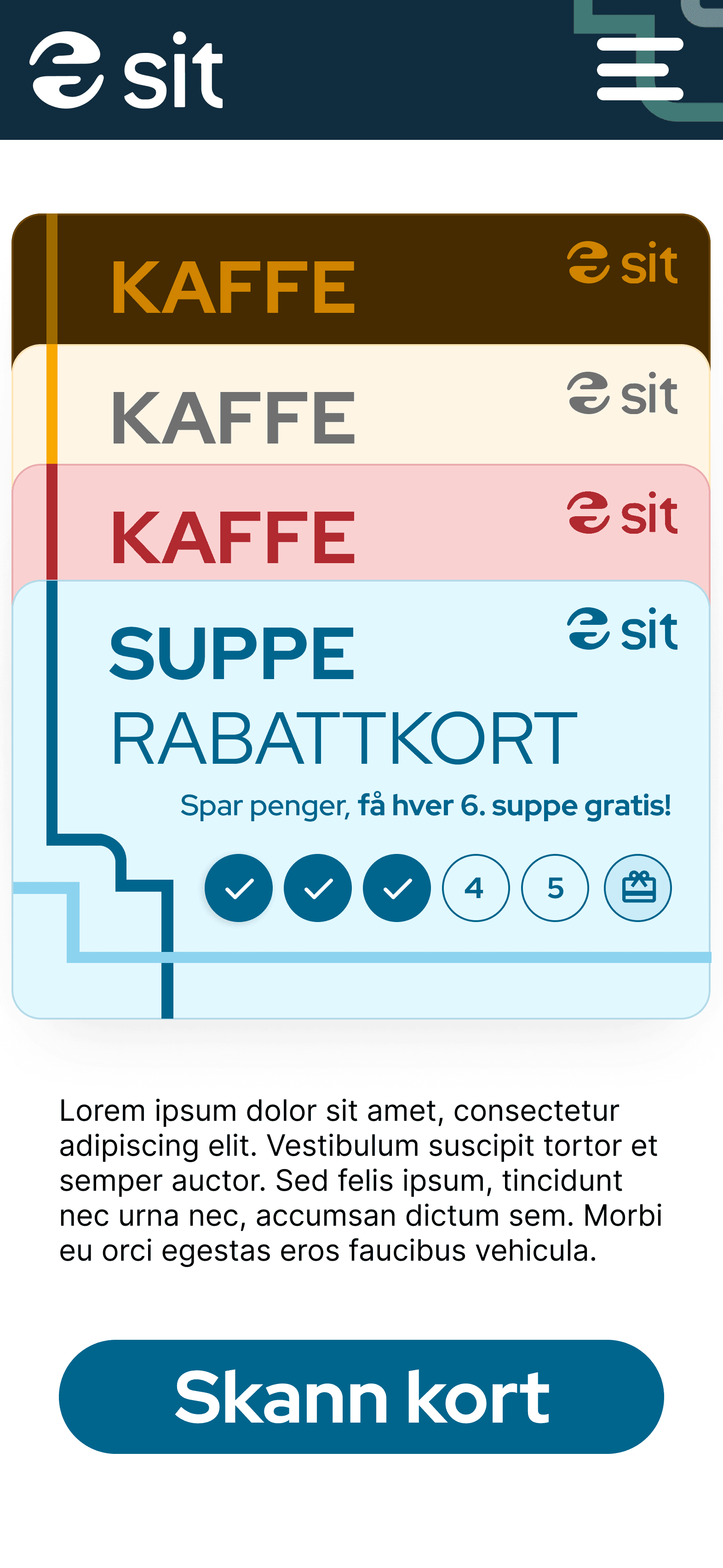
Sit app
The Sit app had mostly been used for contactless shops. Something they wanted to keep, but it wasn’t used enough to keep the app, so they wanted to implement other parts of Sit to it. I sent out a survey to see what the students expect to find in a Sit app, to see if they had any ideas that Sit had already been thinking of, or ideas we hadn’t thought of at all.
After i sorted the answeres from the survey, i tried to implement them in a low fidelity prototype. The prototype looked like a mid fidelity mock up, that way it wouldn’t be difficult for the others on the team to visualize how the changes would look.
Sit as one
Because of the use of different websites for different purposes, “min side” looks quite different on the two sides. Therefore i started focusing on the brand Sit, and i also did a workshop on “min side” with five students.
This resulted in an answere i was looking for through my whole design internship: How do we make the Sit services seem as one. The answere turned out to be kind of the opposite we started out with, create a clear difference. The students didn’t mind the sites being different, or not on the same website, but they wanted a clear distinction between the services Sit offers.
My final recommendation for this was to give the different services a main color that is used, that way it is always assosiated with it. The colors are based on Sit’s own color palette, where i got the students input in what color they assosiated with what color.
*key findings from survey - after affinity diagram sorting
housing info
digital discount card
shortcut
to course
about Sit
canteen menus
food offer

housing
canteen & catering
gym/workout
health
course