
redesign of
VARDAL
TURNFORENING
Scope
A gymnastics team in the city where i study, wanted their website upgraded. Through the course “information architecture”, we looked into how to better existing product, as well as developing a mobile version that would help the trainers with scheduling and communication.
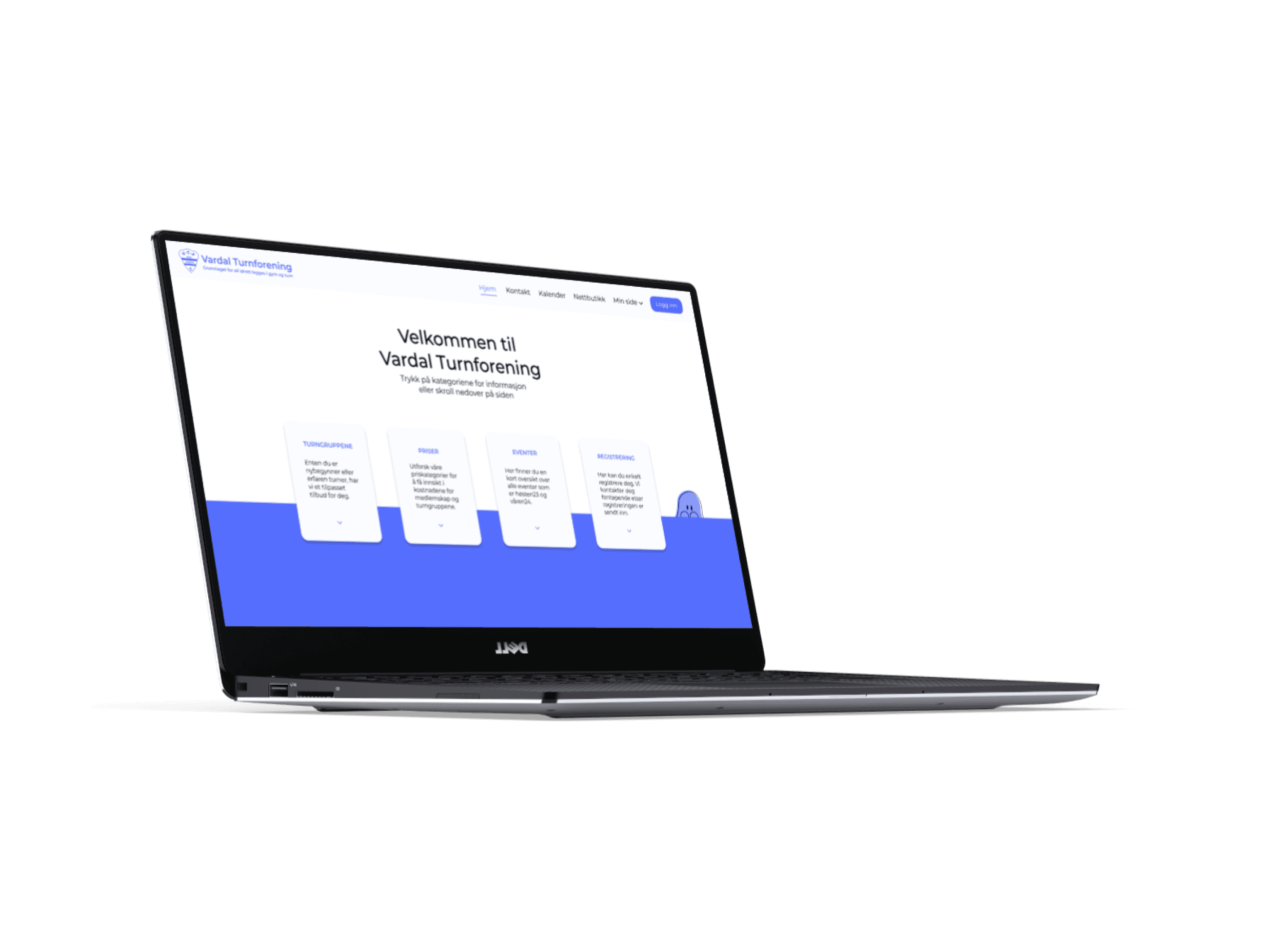
We focused on designing mobile first, and then implementing the elements that would also be found on the website, into desktop.
We followed the guide and method “The five elements of UX design”, for the design process. From our main insight, which was a interview i personaly did with a trainer, and interviews provided from the rest of the class with parents, and board members, we chose to focus on a communication system, a easier access to training notes, and an easier way to sign your child up to gymnastics. our group concisted of two interactional designers and two graphic designers.
Tools
We used Figma to make wireframes and prototypes, and Figjam for sorting our insight and ideation. We used Adobe Illustrator to create some of our visual elements.
Method
Abstract
Strategy
Scope
Structure
Sceleton
Surface
Concrete
The original logo
Original figuers
Current figure: Turnus

The original color
75% opacity
50% opacity
25% opacity


My contribution
For the project i wrote the interview guide and held the interview. I wrote our primary persona, however we all worked on the scenario, to make sure we captured the essence of the trainers issues. I then helped sort finds from other interviews that the rest of our class had, into an affinity diagram. Before we all started sketching.
After this i came up with the color palette, based on different opacities of the original color for the team. I also created some figures to use, in Adobe Illustrator. We didn’t end up using them, but they were used as inspiration for the maskot we use on the site, Turnus.
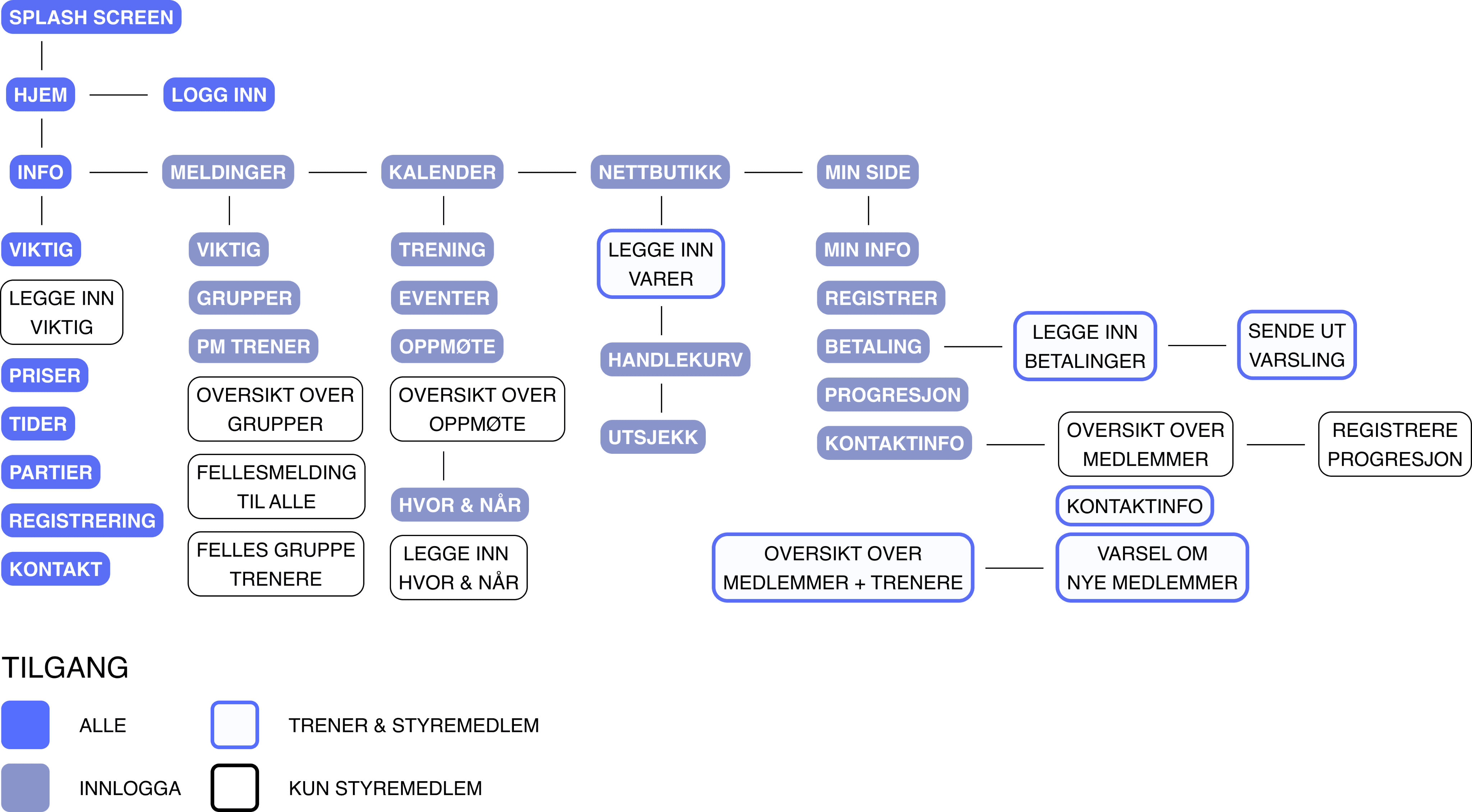
I was also a big part of creating the sitemap, this was my first time creating one, and i learnt alot from it, both positive things and negative things.
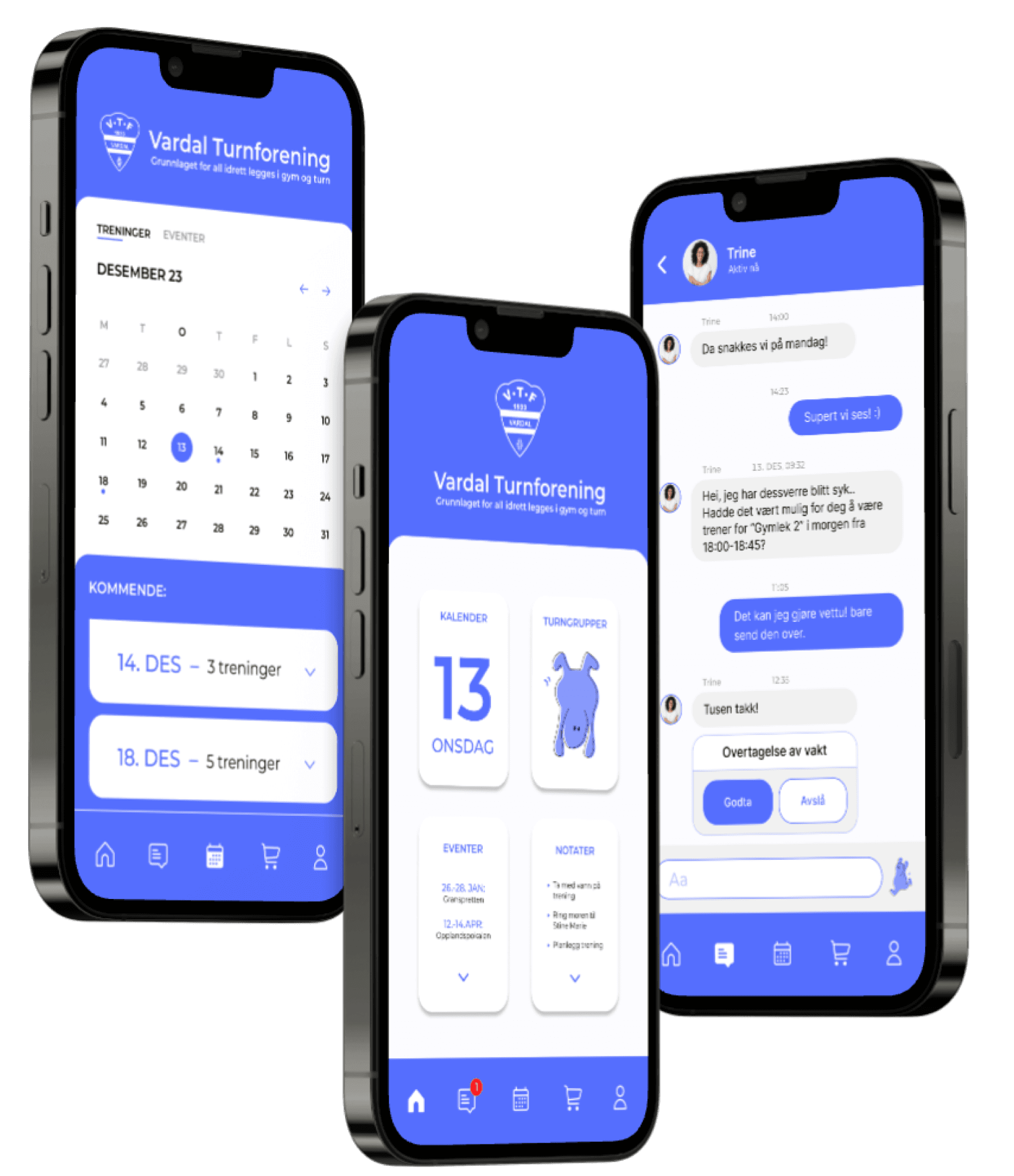
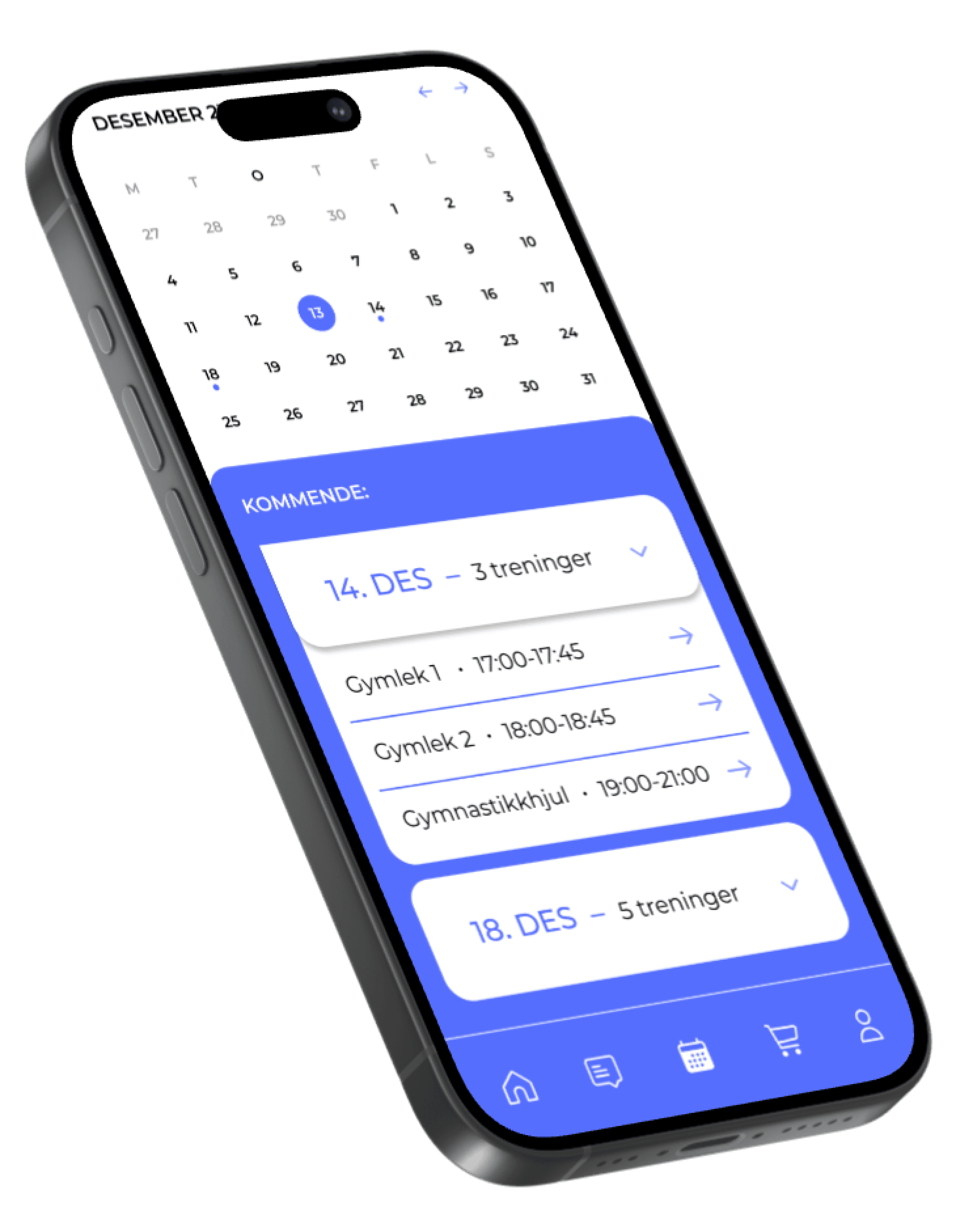
We then moved on to wireframes and prototyping, where we all made wireframes. For the prototyping i worked on the mobile version, and mainly the sides that were a part of the scenario. Especially the calender.

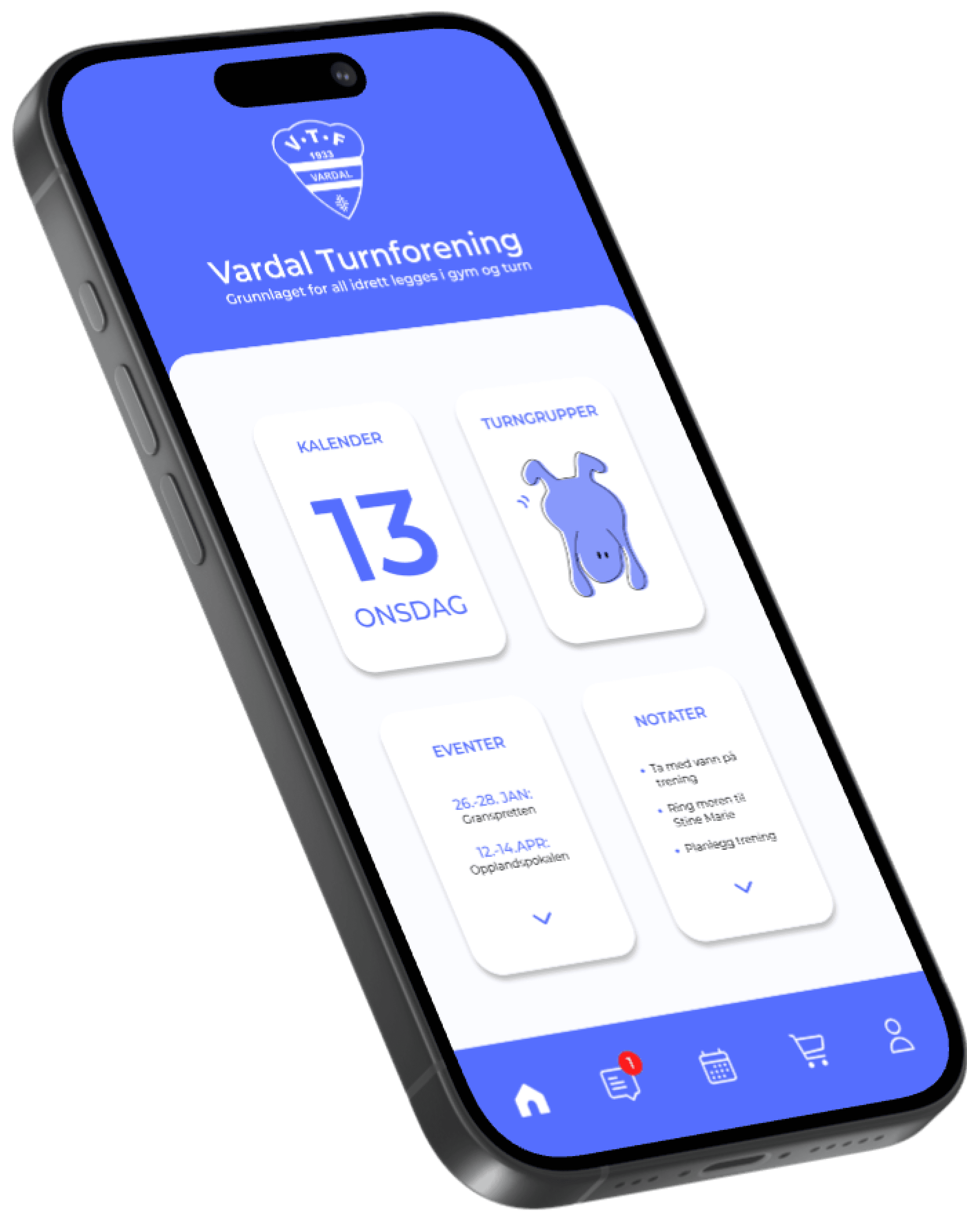
Calender, based on the spacing and letter size of Apple calender.
choose a scheduled training to get more information about it
pick the day you want
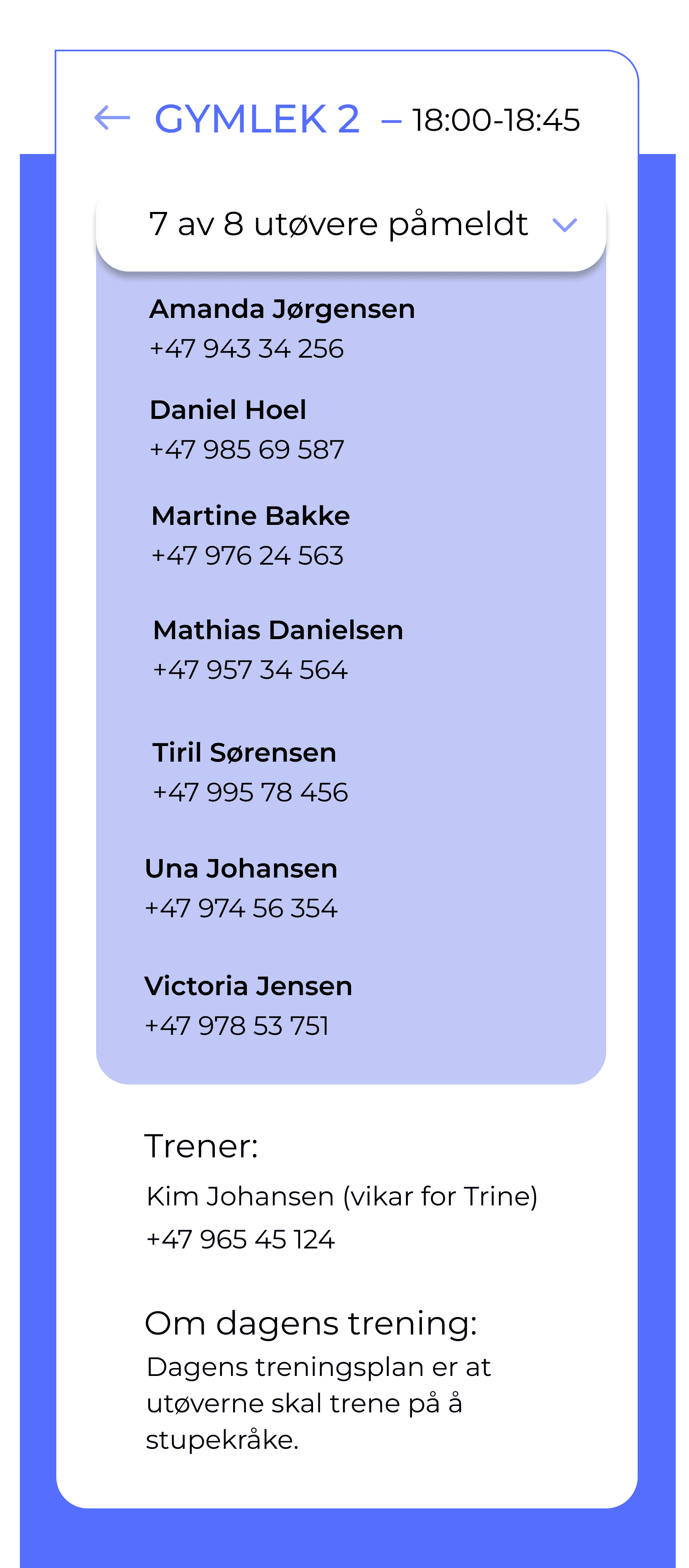
see who is coming, and their contact information
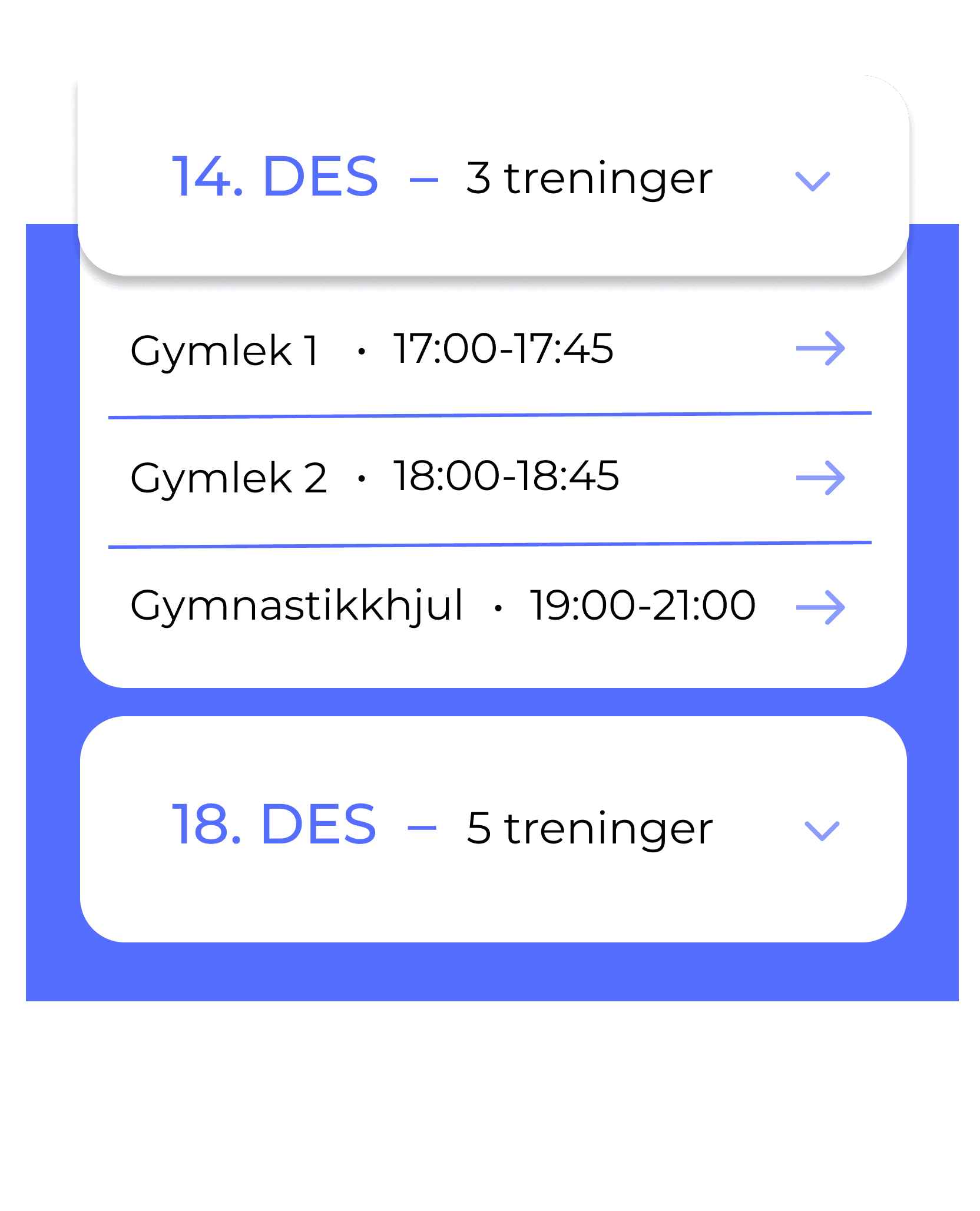
* The drop down menus, of the different steps
The solution
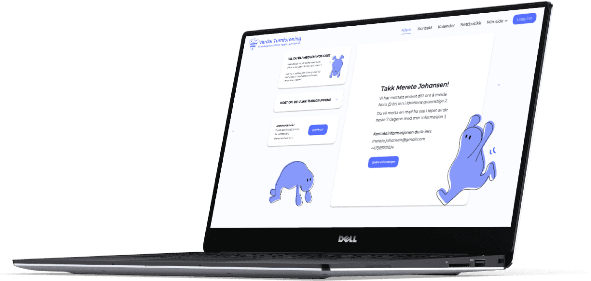
We had two different scenarios in mind when we created the mobile version, and the desktop version. The mobile one was based on our main persona, the trainer, and the desktop one is based on our parent persona. Both platforms share some similarities, however, due to time and team size we were not able to do two high fidelity prototypes with everything the final product would have likely contained.
Sitemap over den nye side strukturen
Trainer - Mobile
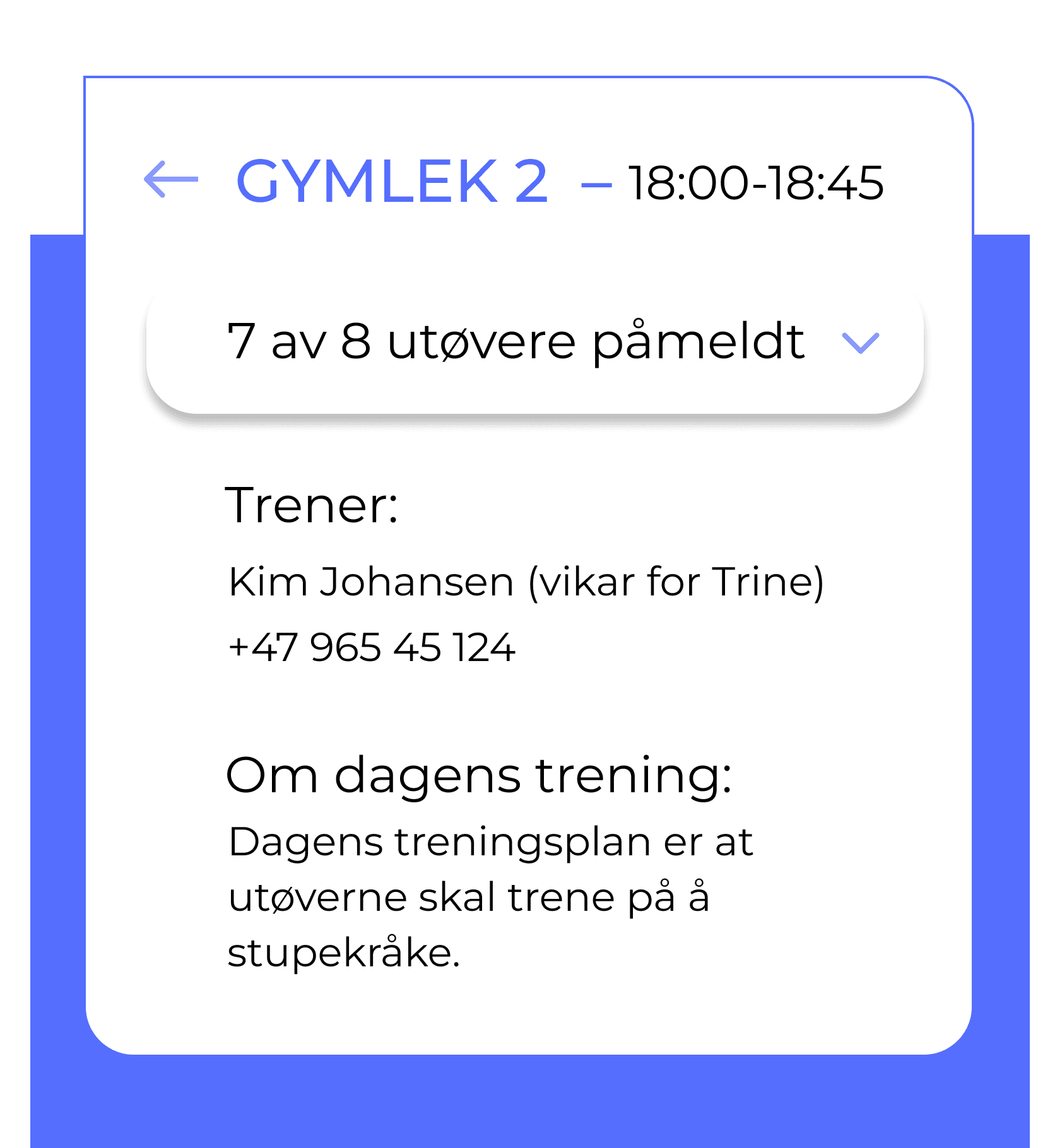
Kim receives a request to step in as a substitute for the class “Gymlek 2” tomorrow. She needs an overview over how many will part take, so that she can assess how many additional trainers she will need.
In addition to this Kim will need information about the different childrens progress, and the original trainers plans for the class, so that she can plan a well thought out training program for the children.
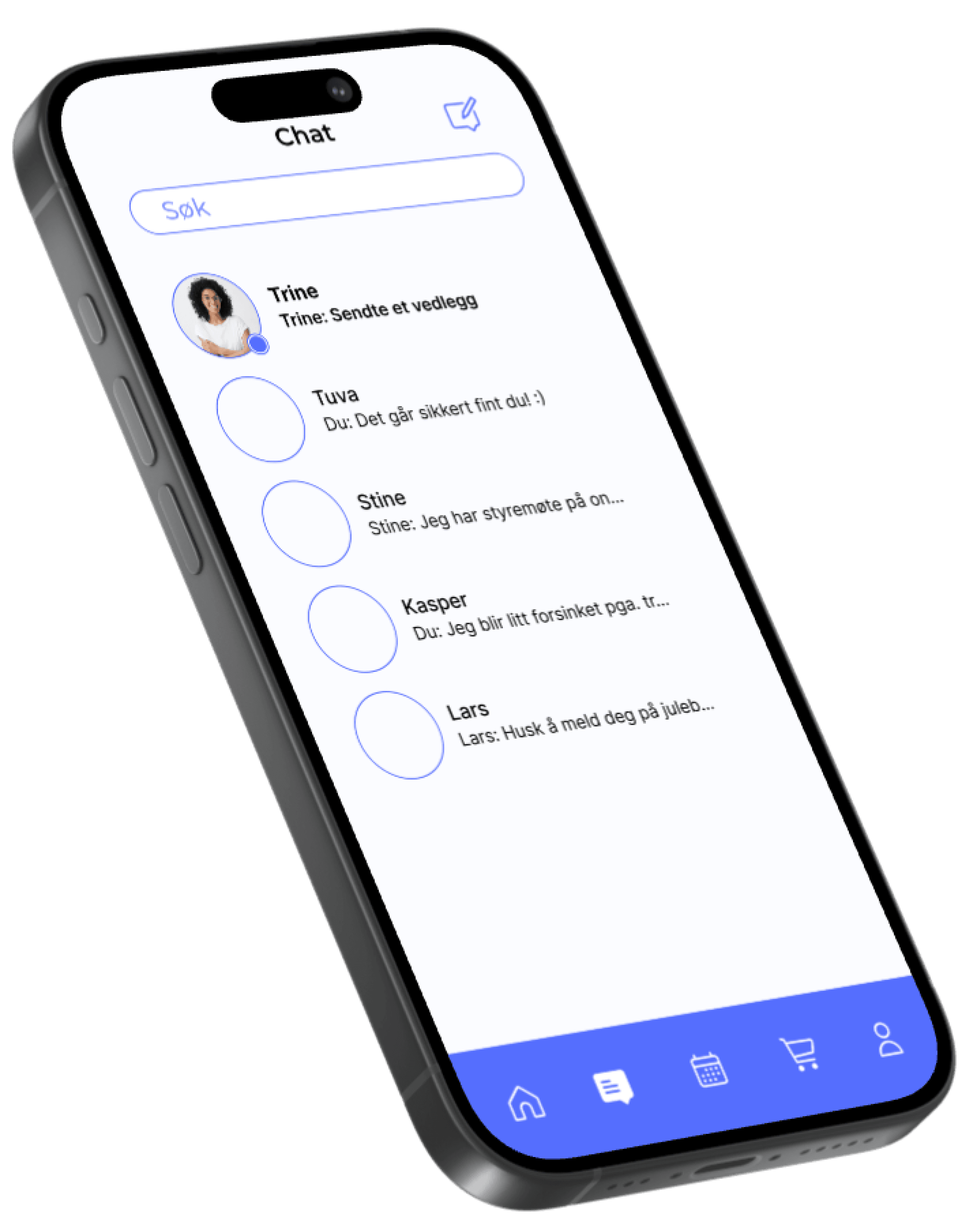
On your home screen, you can se you have a message, so you go to your messages.

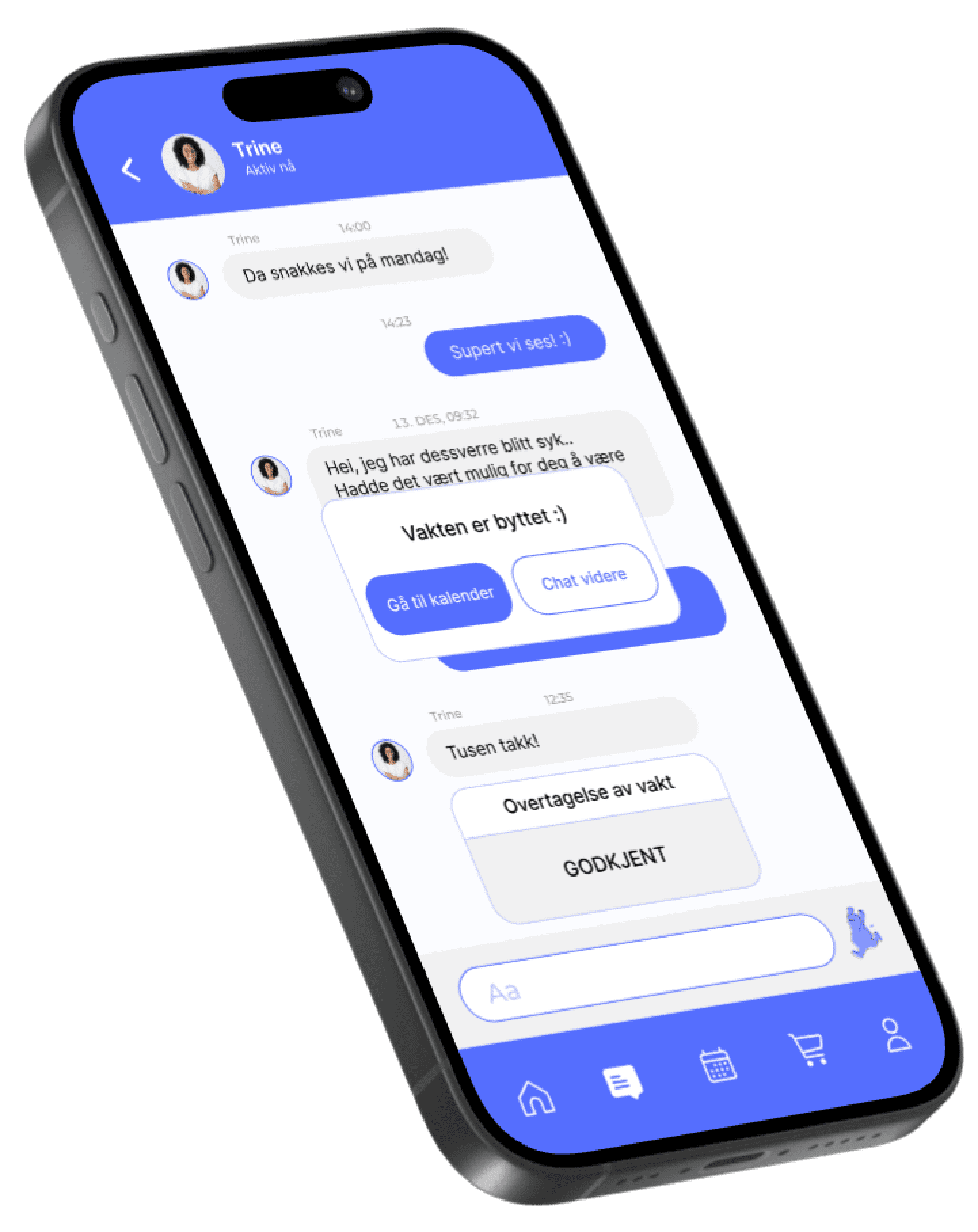
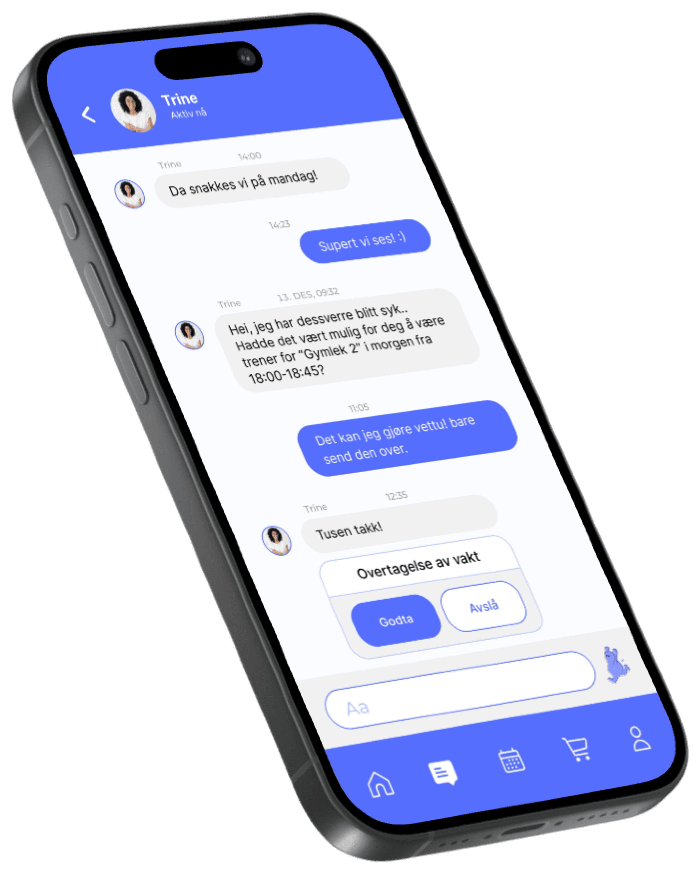
You open the message, see a request. You then decide to accept the request.

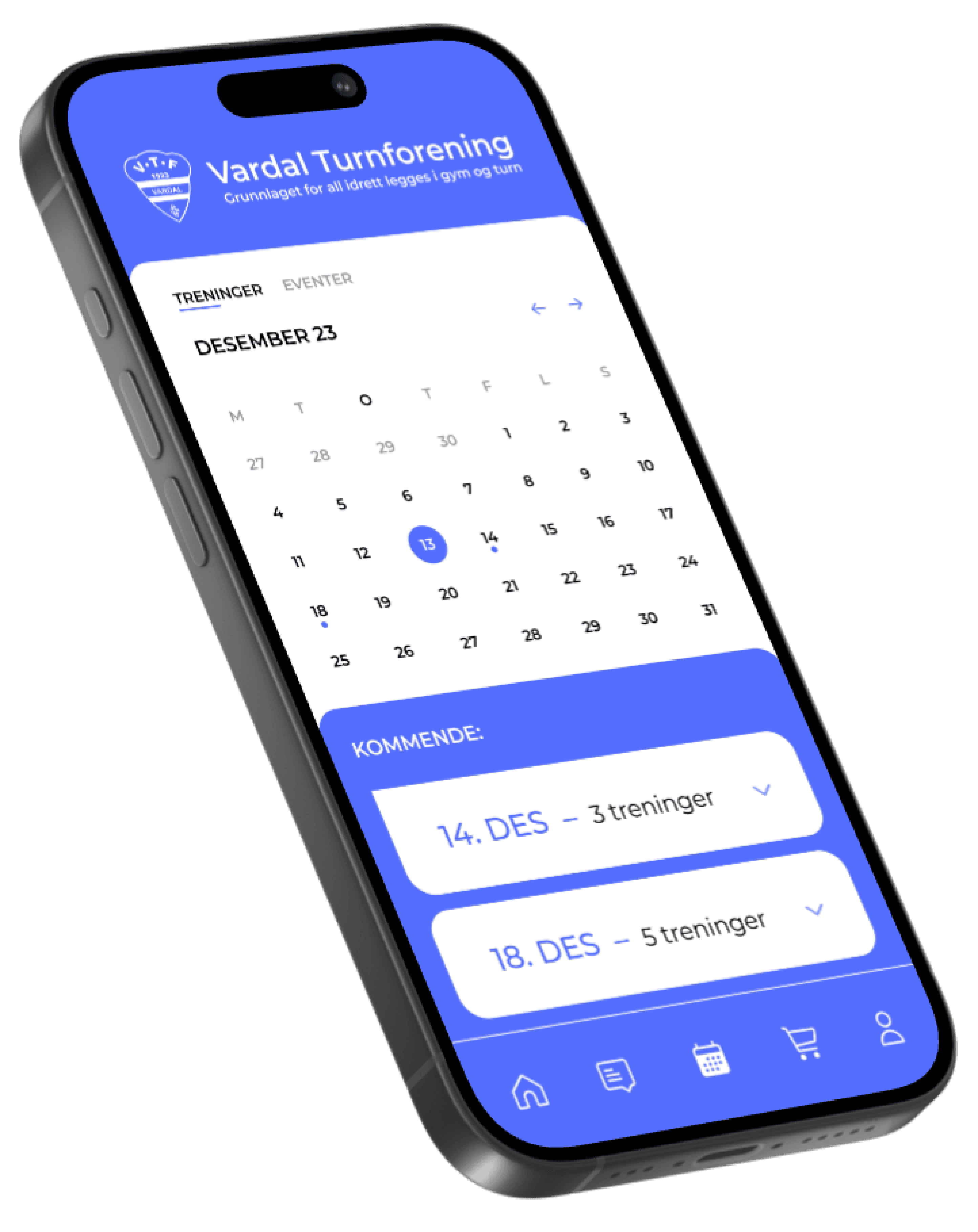
You can now find the class you accepted, in your calender.

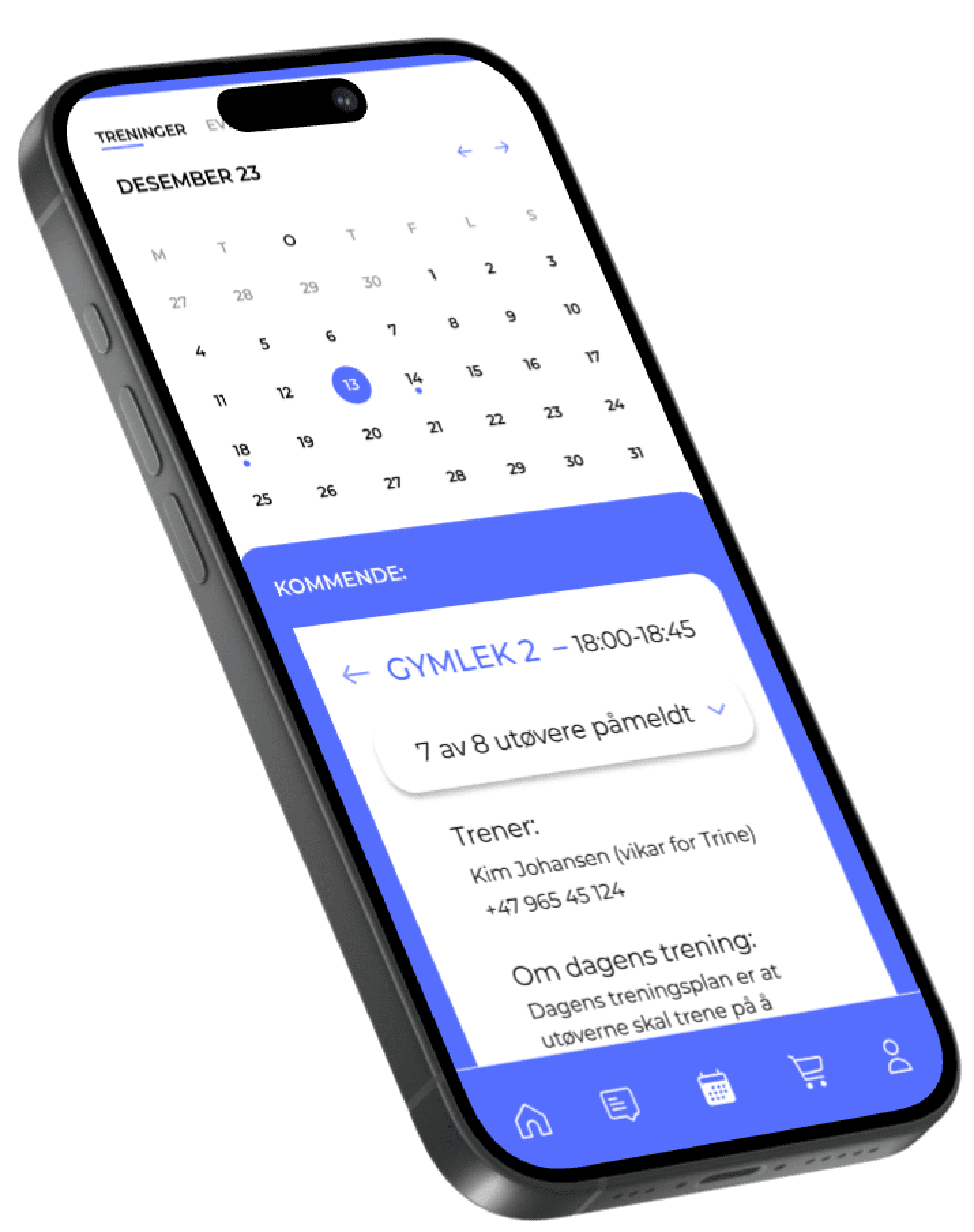
When you choose the class, you will now find information about each participant, and how many are partaking!